
Compare Scenarios
After constructing scenarios, compare them in the Compare Scenarios tab. You can compare strategies at any stage of the project, both graphically and numerically.
Use the eye icon toggles in the left-hand panel to add or remove scenarios from the Compare charts. Scenarios will be plotted in the order in which they appear in the left-hand panel list.
Emissions Over Time
Section titled “Emissions Over Time”This figure compares each scenario to the baseline across the analysis period.
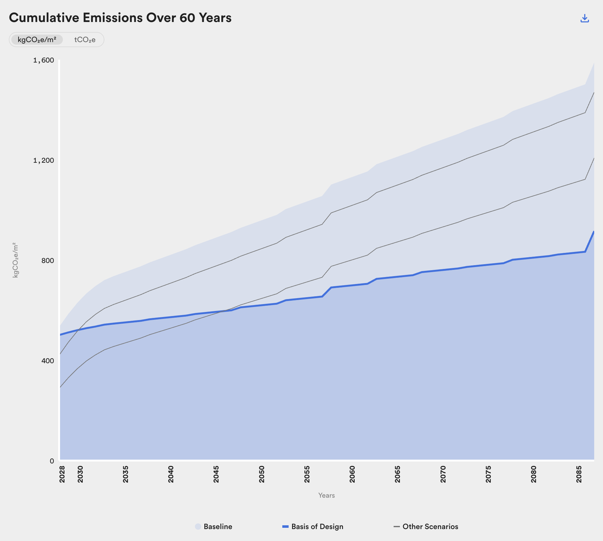
Time series comparison of baseline and three scenarios for a project.
Note that some carbon reduction measures can actually increase emissions, an effect that can lead to confusion in interpreting the Cumulative Emissions figure. For instance, substituting the structural system can increase or decrease the embodied emissions depending on the nature of the change, or the addition of a PV array incurs embodied emissions even if it lower operational emissions over time. Accordingly, the patterns in this figure require interpretation based on the carbon reduction measures modeled for each scenario.
Emissions Summary
Section titled “Emissions Summary”This figure compares the cumulative emissions for each scenario at the end of the analysis period.
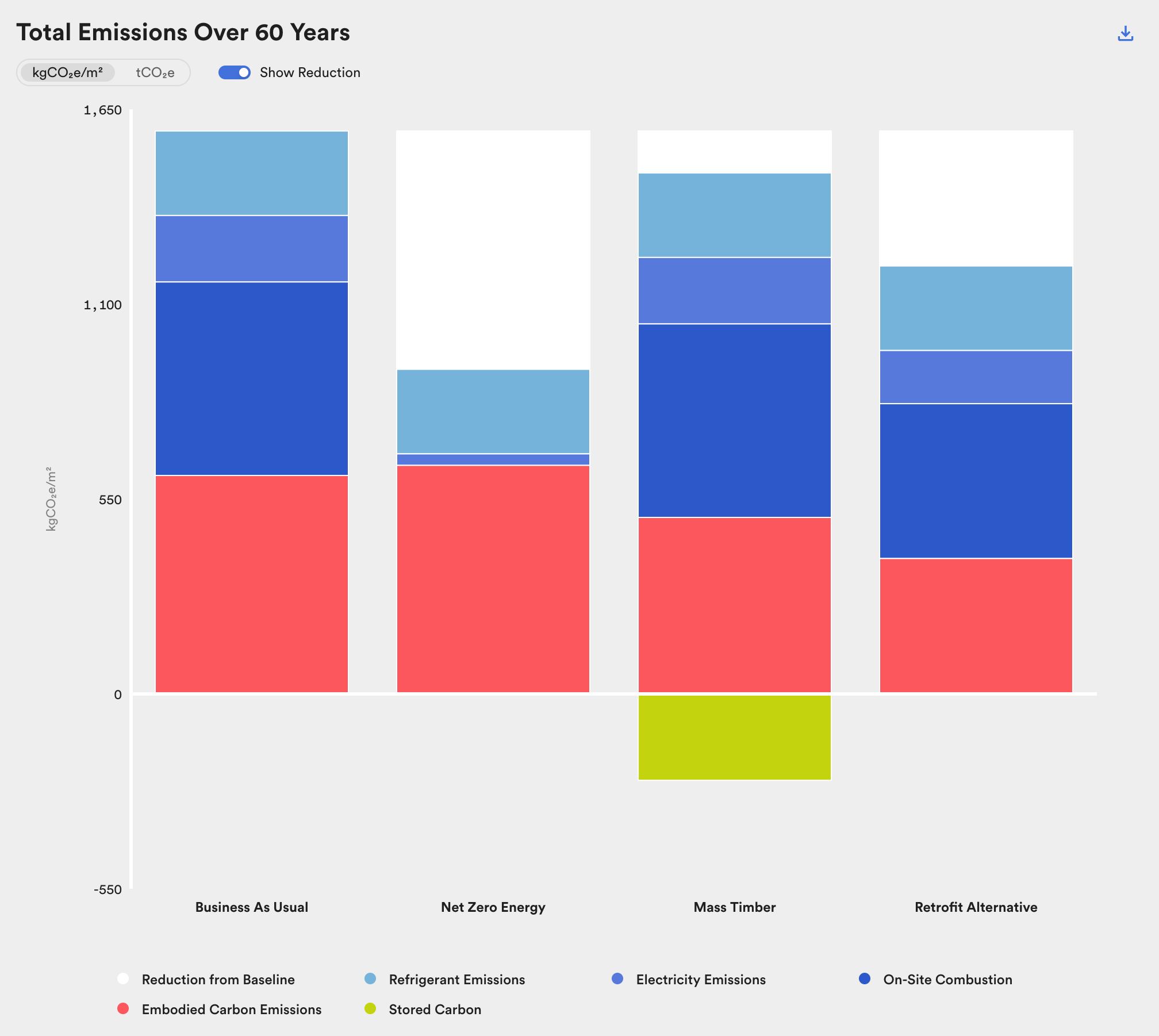
Comparison of embodied and operational emissions and stored carbon over 60 years.
In addition to comparing magnitude of emissions at the end of the analysis period, this chart is useful for comparing the proportion of emissions between scenarios. In comparing these proportions, however, please note the selected analysis period. Operational emissions accrue over time, so the proportion of embodied to operational emissions is highly sensitive to the study's time horizon. The time horizon in C.Scale is shorter than those most often used in wbLCA in order to support project teams in meeting time-based climate targets.
See the Glossary for definitions of all chart elements.